
As mobile devices have become an integral part of our daily lives, consumers increasingly prefer shopping on smartphones and tablets. This trend has made mobile optimization essential for e-commerce businesses looking to maximize sales and user engagement. Mobile optimization refers to the process of creating a website that is easy to navigate and use on smaller screens. This blog explores the importance of mobile optimization for e-commerce, the benefits it offers, and actionable steps to create a seamless mobile shopping experience.
Why Mobile Optimization Matters for E-commerce
Mobile optimization is no longer optional. According to recent statistics, over half of global online traffic comes from mobile devices, and this number continues to grow. If your e-commerce site isn’t optimized for mobile, you risk losing potential customers to competitors with a more user-friendly mobile experience.
Key reasons mobile optimization matters in e-commerce include:
- Improved User Experience: Mobile optimization ensures customers can easily browse, search, and complete purchases on mobile devices.
- Higher Conversion Rates: A smooth mobile experience encourages users to complete their transactions.
- SEO Benefits: Google prioritizes mobile-friendly websites in search results, increasing your chances of reaching a wider audience.
The Benefits of Mobile Optimization for E-commerce Sales
1. Enhanced User Experience
A positive user experience is crucial in today’s competitive e-commerce landscape. Mobile optimization ensures that users can quickly navigate your website, access product information, and complete purchases without frustration. Elements that contribute to an enhanced mobile experience include:
- Responsive Design: A design that adjusts seamlessly across different screen sizes, ensuring text, images, and buttons are easily accessible.
- Faster Loading Speed: Mobile-optimized websites load faster, reducing bounce rates and keeping users engaged.
With a mobile-friendly website, customers can browse and purchase with ease, increasing the likelihood of repeat visits and higher sales.
2. Increased Conversion Rates
Mobile optimization directly impacts conversion rates. Studies show that mobile users are less likely to convert on websites that are difficult to navigate. By optimizing your e-commerce site for mobile, you create a frictionless shopping experience that encourages users to complete their purchases.
Key features to consider for boosting mobile conversions include:
- Mobile-Friendly Payment Options: Enable one-click payments, digital wallets (like Apple Pay and Google Wallet), and saved payment information to simplify the checkout process.
- Clear Call-to-Action Buttons: Use large, easily clickable buttons for “Add to Cart,” “Buy Now,” and “Checkout” to guide users through the buying process.
- Guest Checkout Option: Allow users to complete purchases without creating an account, reducing friction and improving conversion rates.
3. Higher Customer Retention and Loyalty
A mobile-optimized website keeps customers returning by providing a consistent and enjoyable shopping experience. When users know they can rely on your site for a hassle-free experience, they are more likely to become repeat customers. This loyalty is especially beneficial in e-commerce, where customer retention plays a key role in long-term growth.
Example: An e-commerce business can offer a mobile app or an optimized mobile site that allows customers to browse past orders, track current shipments, and save favorite products. These features make it convenient for customers to engage with the brand, increasing the chances of repeat purchases.
4. Boosted SEO Rankings
Mobile optimization also benefits your site’s SEO. Google and other search engines prioritize mobile-friendly websites, particularly after the rollout of Google’s mobile-first indexing. A website that performs well on mobile will rank higher in search results, increasing your visibility to potential customers and driving organic traffic.
To improve your mobile SEO:
- Implement Responsive Design: Ensure your website is mobile-friendly and adjusts across devices.
- Optimize Loading Speed: Compress images, reduce redirects, and minimize code to ensure faster loading.
- Mobile-Friendly Content: Create concise, easy-to-read content optimized for mobile users.
5. Better Social Media Engagement and Sharing
Since most social media usage occurs on mobile devices, a mobile-optimized website enhances the connection between social media and e-commerce. If users click on your ads or shared posts and land on a mobile-friendly site, they’re more likely to explore, engage, and complete purchases.
Example: E-commerce businesses can utilize social media platforms to share product links, promotions, or user-generated content. When these links lead to a mobile-friendly website, it encourages users to stay, browse, and make purchases directly from their mobile devices.


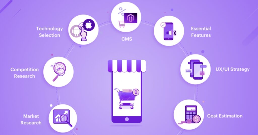
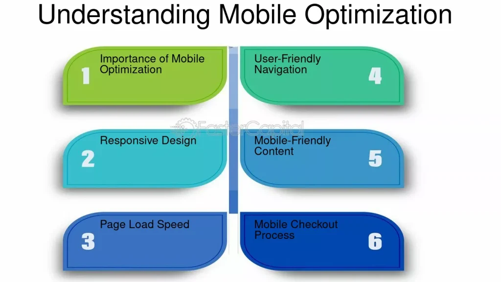
Steps to Optimize Your E-commerce Site for Mobile
Here are some practical steps to ensure your e-commerce website is fully optimized for mobile users:
1. Implement a Responsive Design
A responsive design adapts to any screen size, providing a seamless user experience on smartphones, tablets, and desktops. By implementing responsive design, you ensure that all users, regardless of device, can access and navigate your site effortlessly.
2. Simplify Navigation and Search
Mobile users typically have less patience for complex navigation structures. To improve usability:
- Use a simplified menu that’s easy to access, often using a “hamburger” icon.
- Add a search bar at the top of the page to allow quick searches for products.
- Enable filters and sorting options for easier product browsing.
3. Optimize Images and Media for Faster Loading
Loading speed is critical for mobile users. If a site takes longer than a few seconds to load, users may abandon it. To enhance speed:
- Compress images without compromising quality.
- Use lazy loading so images load as users scroll.
- Minimize pop-ups or ads that can slow down page load times.
4. Streamline the Checkout Process
A complicated checkout process can lead to abandoned carts. To make the process as smooth as possible on mobile:
- Implement auto-fill options for faster data entry.
- Allow guest checkout for customers who prefer not to create an account.
- Integrate mobile payment options such as Apple Pay, Google Pay, and PayPal.
5. Use Clear and Touch-Friendly CTAs
Clear and well-placed call-to-action (CTA) buttons are essential for guiding users through the purchasing process. Tips for effective CTAs include:
- Make buttons large enough to tap easily.
- Use action-oriented language like “Buy Now” or “Add to Cart.”
- Place CTAs in visible locations on each page.
6. Optimize Content for Mobile Readability
Mobile users prefer concise and skimmable content. To enhance readability:
- Use short paragraphs and bullet points.
- Create descriptive headings that guide readers through the page.
- Keep product descriptions clear and to the point, ensuring important details are easy to find.
Tracking the Impact of Mobile Optimization
After implementing mobile optimization, it’s essential to track its impact on your e-commerce sales and user engagement. Some key metrics to monitor include:
- Mobile Conversion Rate: Check the percentage of mobile visitors who complete purchases.
- Bounce Rate: Track if mobile visitors are staying on the site or leaving quickly.
- Average Session Duration: Monitor the time mobile users spend on your website.
- Cart Abandonment Rate: Check if users abandon their carts mid-checkout and address any potential obstacles.
Using analytics tools, like Google Analytics, you can gather valuable data on mobile performance and make further adjustments to improve the user experience.
Conclusion: Embrace Mobile Optimization to Boost E-commerce Success
Mobile optimization has become a cornerstone of successful e-commerce businesses. By prioritizing a mobile-friendly experience, e-commerce sites can boost user engagement, increase conversion rates, and enhance brand loyalty. From responsive design and fast loading speeds to mobile-friendly checkout and clear CTAs, mobile optimization ensures your site is accessible and enjoyable for customers on any device.
As mobile usage continues to rise, businesses that embrace mobile optimization position themselves for growth and sustained success in a competitive digital marketplace. Investing in mobile-friendly practices will enhance customer satisfaction and help drive the sales your business needs to thrive in today’s mobile-first world.

Leave a Reply